For the August team, Madison WI · live record, updated weekly
august-shop.com, redesigned. We are in week three.
This page is the running record of the redesign. It opens on the current week and keeps a log of everything designed and built before it, so you can see the store take shape week by week.
Each week links to its full deck of frames. The deposit is paid; the schedule and the remaining invoices live on the timeline & invoicing page. Production is built in Shopify Liquid on your existing store.
The live store takes over.
Week three keeps the prototype from week two and swaps its insides for the real thing. The catalog is live, the homepage can follow a shopper, and account, search, sale, and the AUX archive are in.
The live store takes over.
Week three keeps the prototype from week two and swaps its insides for the real thing. The catalog is live, the homepage can follow a shopper, and account, search, sale, and the AUX archive are in.
- changed
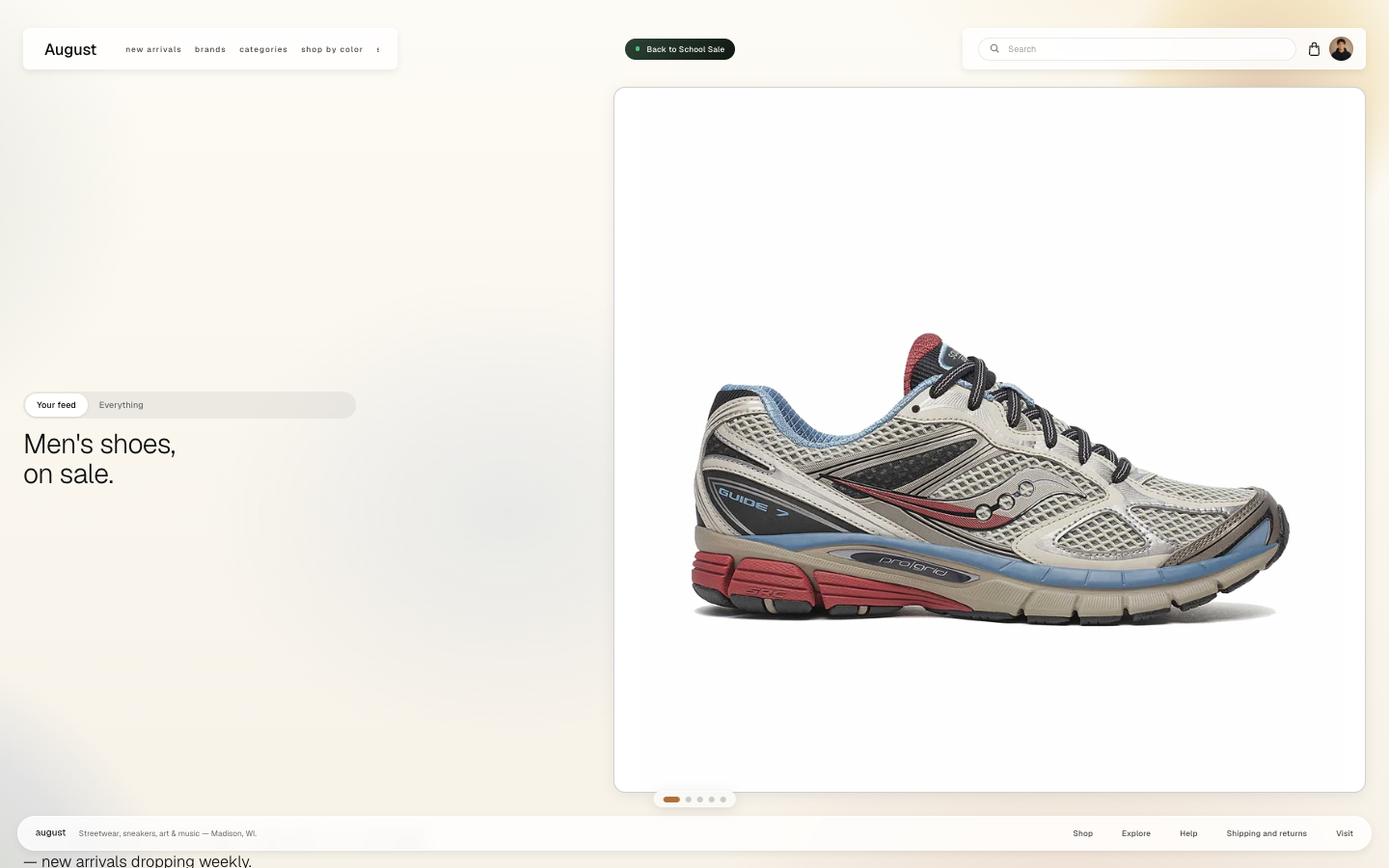
Homepage, your feed
Signed in, the homepage follows the account. The demo is set to men’s shoes on sale, so the headline and hero product change with it. Your feed and Everything sit above the line so you can switch back.
- changed
Homepage, everything
Everything restores the store line, with a little color on art and music. The sale banner from week two is gone; a chip in the header carries Back to School instead, and the bag is an outline next to a demo portrait.
- changed
Homepage, inside the first card
The first card now scrolls before the stack moves on. Under the line: apparel and accessories, best sellers, back in stock, then a note that the next card is a brand. Product photos sit in the frame without cropping.
- changed
Mega menu
Brands is the live directory now, grouped A to Z. The panel is pinned to a quarter of the screen and scrolls inside itself. The four sample products from week two are gone.
- changed
Brand cards
The banner is full bleed at every desktop width, lined up with the header gutter. The footer and the sale chip are light, so they sit on the photo instead of a dark bar.
- changed
August AUX
Radio is the real archive. Mixes from the shop, paged, with a player and a link through to the full archive. Events and the newsletter sit further down the same card.
- new
Account
A signed-in account page. The feed preferences here are what drive the homepage: department, category, sale only. Orders, details, brands, and the Madison pickup store sit beside it.
- changed
Shop
The grid is the live catalog, not the sample set. New arrivals is forty-seven products. Photos are contained so nothing is cropped, and sale prices are struck through.
- new
Search
Search from the header lands on the same grid, with the query in the count. Nike returns six.
- new
Sale
Sale is its own page. Everything currently on sale, original price and sale price on the card.
- changed
Product
The same buy box as week two, now on a live product. Size, the price on the button, Madison pickup, and a row of more from the shop.
- changed
Mobile menu
The hamburger is the word menu. The panel has the sale chip, search, the links, and a swipeable row of promo tiles for new arrivals, brands, and the sale.
- changed
Brand cards, mobile
Square Trade and Dr. Martens use a vertical image on the phone, so the whole shoe is in the frame instead of a crop of the desktop banner. The tab bar adds Radio.
The wireframes, made clickable.
Week two turned the week one frames into the first working store: a card-stack homepage, mega menu, brand cards, radio, shop, product, and bag you can click through, built to port into Shopify Liquid.
- added
Homepage, card stack
The wireframe homepage became a stack of cards, the way iOS stacks notifications. The first card holds the sale banner, the line, and four products. Dots at the bottom move through the stack, and a radio chip sits in the corner.
- added
Mega menu
Brands opens a glass panel over the page: the brand list, four shoppable products, and an editorial tile. Same structure as the week one menu, now in the working prototype.
- added
Brand cards
Each brand is its own card in the stack. Vans, Square Trade Goods, and Dr. Martens, full bleed, with shop now into the collection.
- added
August Radio
The last card is a player. Three mixes from the shop floor, a waveform, and a short note underneath. The first pass at AUX, before the real archive.
- added
Shop
New arrivals as a grid. Filter and sort open in a sheet, so the page stays put. Twenty-four products in this pass, still the sample set.
- added
Product
Gallery, sizes, and add to bag with the price on the button. Madison pickup is on the card.
- added
Bag
Bag and summary as matching cards. Shipping and tax wait until checkout.
- added
Mobile
A hamburger, the sale banner, and a tab bar: Shop, Search, Bag, Profile. The bag carries a count. Radio stays as a chip above the bar.
Nine frames set the direction.
Week one was the first-round wireframes: the design direction for the whole store, reviewed as static frames before anything was built.
- direction
Floating-island navigation
The store opens on the wordmark, one line of positioning, and a single path into the shop. Navigation, search, and account move into floating islands that persist through the site.
- direction
Homepage order
New arrivals in a grid up top, the AUX NIGHT mixes in a dedicated audio player, and a banner section per brand. Everything on the current homepage kept, in a clearer order.
- direction
Mega menu
Same structure as the live store, but the island expands into a glass panel over the page rather than a full-width dropdown, and the products in the menu are shoppable.
- direction
Shop grid and filter deck
Large product cards with size selection on the card, a filter row that stays fixed while you scroll, and a filter deck that overlays the grid so filtering never means leaving the page.
- direction
Product page, two options
Two layouts for the product page, both with size, price, and add to bag grouped in a single buy box and the price carried on the button. Your read decided the direction.
- direction
Shop by color
New to the store. Pick a tone or blend two, and the catalog re-sorts by color proximity. Built for people who shop by look rather than by brand.
- direction
Bag and checkout
Bag and order summary as matching cards, with shipping and tax shown before checkout. One flat button to finish.
What happens next
- You review the week 3 build and send notes.
- Week four locks the direction for every page.
- Development in Shopify Liquid starts the week after that, on a duplicate theme.
- This page keeps updating as the work lands. The schedule and invoices are on the timeline & invoicing page.
Send notes on the current round whenever you are ready.